





We love to hear stories from our Girl Scouts and volunteers! Let us know what Girl Scouts are doing in your area, meaningful experiences earning awards, and other stories or adventures girls or volunteers in your area have had with Girl Scouting. We may feature your stories on our blog, social media, or other publications. Email us at stories@girlscoutsni.org
The Girl Scout Brand
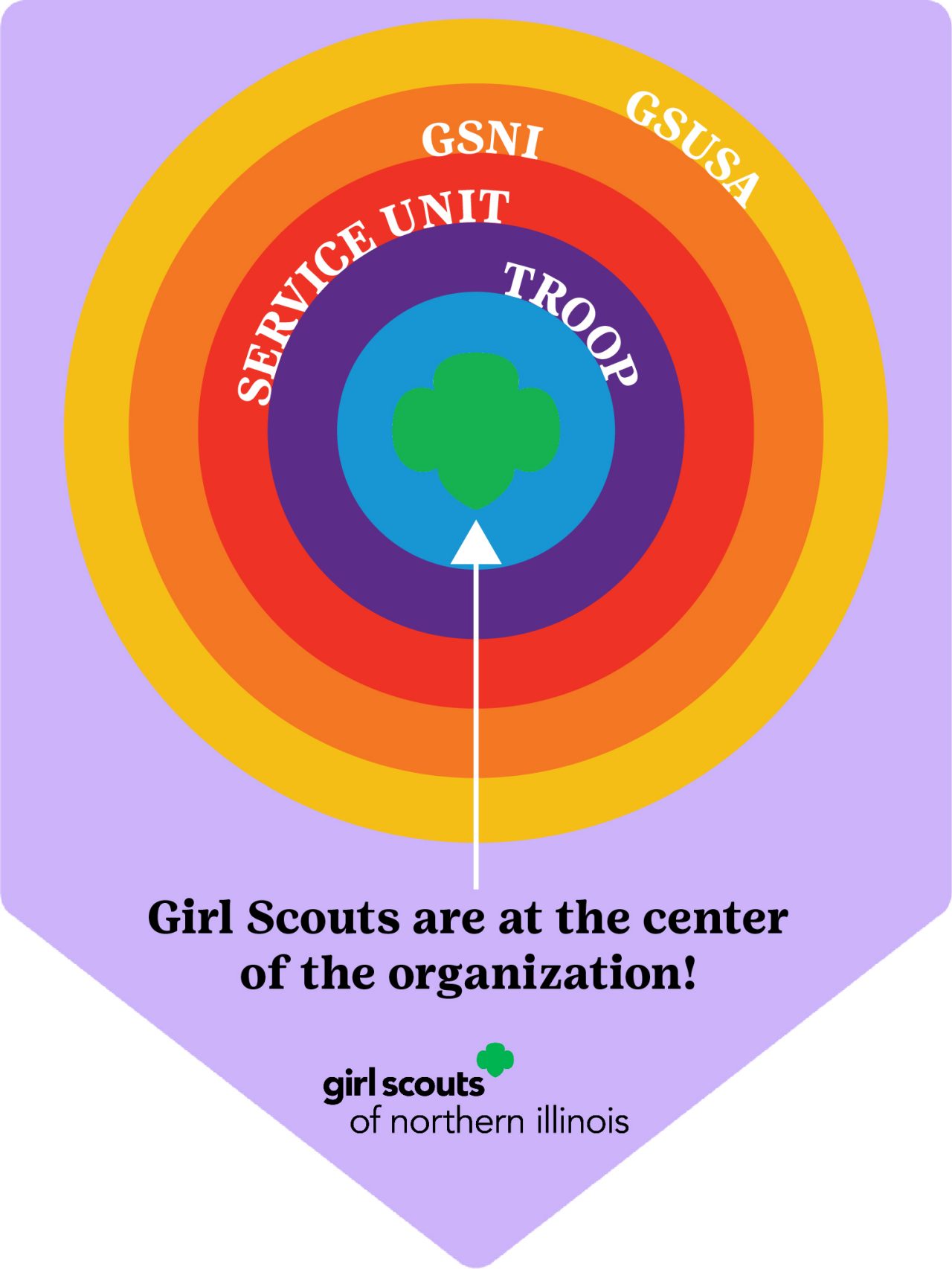
The Girl Scout brand is not just a logo—it is a complete design system that works together to create a distinctive look and feel.
Girl Scouts is a vibrant, living, and constantly evolving community and so is our visual identity. Our brand is not just a logo—it is a design system composed of elements that work together to create a distinctive look and feel for our communications.
Girl Scouts has a robust brand and identity— and everyone in Girl Scouting has a role in protecting our name, our image, and our brand. It is important for all volunteers to represent the Girl Scout brand consistently and appropriately. Below are resources for volunteers who are creating resources for their Girl Scouts and presence in the community.
** These resources are intended for Girl Scouts of Northern Illinois volunteers. If you are not a volunteer, please reach out to our Customer Care Team for assistance with Girl Scout branding assets.
Help us solidify our identity by always using the tools below:





Logos and Servicemarks 
Fonts
Color Palette

Girl Scout Green: Green is our primary color and should be used prominently in external communications, especially for the Trefoil. Two additional shades of green support Girl Scout Green for added variety. Always consider the role of green when creating external communications.
Color Palette: The color palette has been expanded to energize our brand. Please be sure to use RBG, CMYK or Hex color numbering system indicated on the color palette.
Download the full color palette.
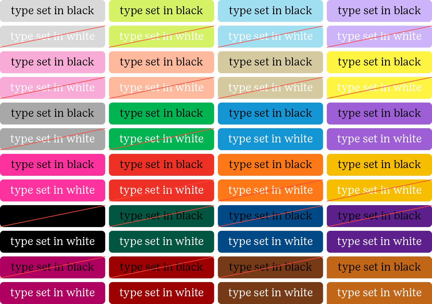
Color Palette Font Usage: Each color on the Girl Scout color palette must have show either black fonts or white fonts. Please refer to the Color palette font usage link below when using typed copy on a color.
Brand FAQs
Representing Girl Scouts in the Community
Language and Wording
T-Shirts, Patches, and Branded Items
Social Media and GSNI
Talking to the Media
Digital Downloads
Share Your Story
Branding Kit on Rallyhood
Branding Guide for Volunteers
GSNI Quick Branding Guide for Volunteers - download this helpful information to refer to when creating branded material.

Is GSNI on social media?
Please follow Girl Scouts of Northern Illinois on Facebook, Instagram, Twitter, Pinterest, YouTube, and LinkedIn. Encourage your friends and other Girl Scouts (age 13 or older with parental permission) and volunteers to do so, as well. Like and share our posts!
How should I represent Girl Scouts?
Model good online behavior for all Girl Scouts. Be professional and appropriate. Do not write anything that would reflect badly or embarrass Girl Scout members or volunteers. Do not engage in online arguments. Proofread your posts. Review GSNI's Social Media Guidelines.
GSNI Social Media Guidelines
Creating Video for Social Media
Model good online behavior for all Girl Scouts. Be professional, clear and appropriate. Do not shoot a video of anything that would reflect badly or embarrass Girl Scout members or volunteers. Keep videos short, engaging and to the point. Preview your videos before you post. Review GSNI's guidelines.
GSNI Social Media Video Guidelines
Do I need to be sensitive about privacy?
Use Girl Scouts’ first names only. Never publicly post phone numbers, addresses, or email addresses. Get photo permission before posting photos of anyone. Know the privacy settings of your accounts. Do not violate copyright laws. Do not use any images without permission.
Adult Photo Permission
Adult Photo Permission (Spanish)
Youth Photo Permission
Youth Photo Permission (Spanish)
What are GSUSA's policies?
GSUSA is dedicated to serving all members. Girl Scouts families of all backgrounds deserve to feel seen—it's at the heart of creating a safe, inclusive space where every Girl Scout can thrive. We welcome healthy discussion, but we ask that comments and posts are kept relevant and respectful. Check GSUSA's Social Media Community Guidelines here.